
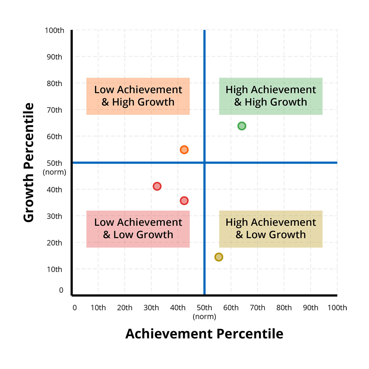
The following chart is a reproduction of the Growth AND Achievement quadrant chart from the NWEA MAP reporting profiles. This demonstrates how each campus compares median percentile rank in growth and achievement. The orange quadrant indicates above average growth but below average achievement. The yellow quadrant indicates above average achievement but below average growth. The red quadrant shows below average growth and achievement. The green quadrant shows above average marks on growth and achievement. Data represents one test per subject per student (cleaned). The Quadrant uses MAP Growth Norms to contextualize grade campus growth and achievement.
View 2025 Winter MAP Growth and Achievement by Campus
NWEA Student Growth Summary Report
Data and Explanations for the Growth and Achievement Quadrant
| Data Point | Explanation |
|---|---|
| Growth Percentile | A percentile ranking based on MAP Growth Norms for observed growth between two testing terms. The graph shows the median (middle) percentile for a group of students. |
| Achievement Percentile | A percentile ranking based on MAP Growth Norms for achievement in one testing term. The graph shows the median (middle) percentile for a group of students. |
| Norm | The 50th percentile. Represents typical achievement/typical growth based on MAP Growth Norms. |
| Median | The middle value when a group of values is ordered from lowest to highest. |